Sunday, October 25, 2015

Oracle in the Crypt


When I was a child, I loved reading  about Greek mythology, and have always had a special liking for the Oracle of Delphi.  The mystery surrounding this priestess of Apollo - well, it intrigues me.... as her boss' purview included music, poetry, prophecy, and healing.... all powerful stuff!

In poking around the web for something inspirational that I could relate to a Halloween journal page involving this oracle, I came across this image of The Oracle from the movie "Percy Jackson and the Sea of Monsters" - something I've not seen, nor will I likely ever see given the poor reviews!  Nonetheless, I found this image (and accompanying You Tube on this animated puppet) fascinating.


I also lucked out by snagging a Tim Holtz  skull die,  and found some awesome inspiration from  both Anna-Karin and Jan Hobbins using this die.  Since I was working in my journal, and did not want a lot of dimension (having already done that for my Tim tag), I decided to go with Jan's technique.

I started out in my larger Dylusions journal by putting a strip of washi tape down the binding between the two pages to protect the rest of the journal from whatever wet media might be applied to these two pages.  Then I gessoed the two pages with a baby wipe, to get a lot of texture.  


Once dry, I added a smidgeon of Distress Micro Glaze, which acts like a resist.  I wanted to preserve some white to serve as a reflection for a hanging lantern I had in mind. 


Then I smooshed the pages around in some Hickory Smoke, Ground Expresso and Black Soot Distress Paint on my craft sheet, having learned my lesson that Distress Stains and Sprays don't really play too well with gesso, at least if you plan on having the color stick around!  I dried, and repeated several times, to get the depth I was looking for.  I prepared two pages, but ending up using only one - but I love the effect on both....


Below you can see the resist from the Micro Glaze..... this is what you see in the upper right corner of the page on the left, above, which is the page I ended up using.


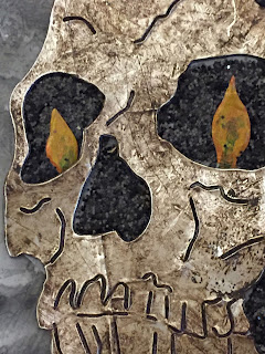
Then I started on my skull..... Jan used foil tape on cardstock as her base, so that is what I did....


and then distressed with the Tonic retractable scratch tool (as Jan did), coated with Wilted Violet Distress paint, wiped off, and repeated with Ground Expresso Distress paint, wiping off just before totally dry.  The beauty of Jan's technique with the foil tape is the shiny surface - it lets you wipe off paint once it is almost dry.....leaving all that yummy distress in the crevasses of the die and scratches from the tool, while still leaving a thin layer of paint on the surface.

Nice and rotten looking, no?  Love all the grunge!!


Now to fill those eye sockets and other cavities with something dark and sinister..... I started by distressing a piece of plain white card with the same colors of distress paints used for the background pages (but no gesso this time).  Then I traced the skull die in pencil, including the sockets, onto the  cardstock and and then cut out the background for my skull.


 I traced the eye sockets and other cavities to provide a guide when applying a thick layer of Glossy Accents...


followed by Black Soot Distress Glitter (as we already know, I dump....)


 And here is the result.  This will provide a perfect cavity into which to put my flame "eyes"!


Now to the hanging lantern....similar to this little baby from last December (before I knew I should make separate posts for each project, lol!


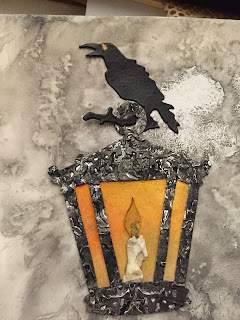
On my Halloween page, I decided to use the other lantern of the hanging lantern die.  I again used foil tape on card and after cutting it, I ran the die cut through an embossing folder.


Then I painted it with Black Soot Distress paint and wiped off most of the paint for a tarnished look. For the background, I  took a piece of old mop up card in pinks and purples. and generously sponged parts of it with Mustard Seed Distress Ink to give it a glow; then I positioned my die cut looking for the best "glow" before cutting the background out to fit inside the die.


I auditioned it .... and it passed! I  pulled up the inner two struts slightly to give a bit of dimension.


I then made the candle to go inside; this little candle die cut is part of two candles in the hanging lantern die. The flame is painted with several warm colors of Viva Decor's Maya Gold paints (which have just a bit of sparkle to them).  I added a smudge of a blue Maya Gold at the base of the flame and applied some texture paste to the candlestick to emulate dripping wax. Once dry, I spritzed the textured candle stick with Antique Linen Distress spray to age it a little.


The two flames for my skull "eyes" were prepared with the same Maya Gold paints used to prepare the candle flame, as described above.


I die cut a bunch of Mini Tattered Floral roses in various shades of red, burgundy, grey and black....rolled them up with the quilling tool per these instructions from Mr. Holtz.


The completed roses were strewn from the jaw of the skull, in gradations of color from blood red through black..... I envision these as prophecies or pronouncements from the skull which issue as living roses in deep red, but which rapidly fade out to black.  Ok, so humor me here!


I also cut a spider and "31" out of black cardstock from this mini magnet die, and heat embossed them with clear embossing powder so they were nice and shiny.  While I was at it, I cut the raven and cat from this mini magnet die set, and also heat embossed them in clear powder.  I did not end up using the cat (alas), but the raven provided the way to hang my lantern.

The spider was embellished with a bit of Viva Decor Pearl Pen in gold, which I also used for the eye for the raven.


And here is the final page, at last!


Thank you so much for stopping by (and hanging in here!)   Please do leave a comment, as I always love hearing from you!  xxx Lynn

I am entering this page into the following challenges:


Sunday, October 18, 2015

Name your poison....October Tim Tag


I have not played along with the monthly Tim Holtz tag challenge since February..... yikes!  But as Halloween is one of my favorite days, and also my birthday, I had to jump in!

I don't have the dies Tim used, but having seen some great inspiration from others such as Carol and Anna-Karin, as well as this little guy who looks like a Crazy Bird in a spider costume (scroll down).... well, surely I could come up with something!!

Butterfly's  work never fails to inspire me, and over time I have learned a lot from her about how to alter real and two dimensional bottles, as here and  here.

This last post led me to indulge in Tim's Apothecary Bottles Bigz die (#658715).  And of course, I've done nothing with them....

But they came to mind when thinking about what I could pop up to a three dimensional look for this tag.  I knew I could make use of Wendy Vecchi's Clearly for Art, which is a crazy wonderful acetate that molds with heat, and then retains the molded shape once cool.

I knew I did not want the bottles to be translucent, so after poking around online, I found this demo from Tim, using his Frosted Film with Wendy Vecchi's Clearly for Art to great effect; you can see the demo here.  So I put a sheet of Frosted Film (cut to size as it comes on a roll) on the 8 x 11 inch Clearly for Art sheet.  I poked out a few larger air bubbles, but didn't worry about smaller ones as overall I thought they would add to the vintage look of these bottles.

Once I had the film applied, and the bottles cut, I colored the bottles and their stoppers on the film side with alcohol inks (you can use any permanent ink).  I applied Mushroom alcohol ink to the "clear glass" part of each bottle as well.  And then I stamped "Poison" and other appropriate labels from the "Undertaker" stamp set from Stamper's Anonymous (CMS240), using StazOn black ink.


I've been watching Buddy and his very creative stamper companion having tons of fun with Ranger's foil and Sticky Embossing Powder.... so decided to use that technique on my bottle edges, to give them a bit more dimension.  Here is a link to see Tim demonstrating how to use foil with Sticky Embossing Powder, which is actually powdered glue as he says.... maybe that will help me keep it straight!

I brushed the edges of my bottles with Versamark ink, and then covered  with (well, ok, I dumped on) the Sticky Embossing Powder.  Note that after you remove the excess, you do NOT want to flick off any extra - as you want the glue to be there!


However, I did want to knock the edges back a bit, so I did this with my finger, and then used a small stiff paintbrush to take the powder off the rest of the bottle where I did not want foil.  Although I live in Connecticut, and we generally have a good bit of humidity to combat static cling, today has been quite chilly and with the heat on, the glue particles tended to create a thin layer all over the bottle from static.


I heated each bottle separately, so that I could apply the foil (I used the bronze) before the glue dried, as once it is dry, you cannot reactivate it.  The color looks gold here, but is actually a deep brown/bronze color.  I also further distressed it with some ground expresso DI (after this picture was taken).


After completing all three bottles and their respective stoppers, I used my Heat Tool to shape them to look like bottles by squeezing them gently when heated (and pliable) and then letting them cool.  I liked how they turned out, but if I didn't, I could always reheat and reshape. Then I did the same with the stoppers. I ended up painting the stoppers with Ground Expresso Distress Paint, to give a bit more "umph" in the color, and then added Crackle Glaze to the stopper of the largest bottle.


I've repeated the "flat" picture to show the difference in dimension once the bottles were shaped.


I glued the stoppers to the inside of each bottle - as when I had them on the page, the dimension looked wonky - flat to round.   I also painted each bottle with Distress Crackle Paint - not sure if my jar of this is too old, but it didn't really crackle - or maybe it is because I am working on the Frosted Film side.... but no worries, because it still all came out looking pretty grungy.

Here is the stopper with the Crackle Glaze, and you can also see the effect (not crackle) from where I applied the Distress Crackle paint.


For the background, I used an extra large tag and used a wrinkle free distress technique with Antique Linen, Brushed Corduroy and Pumice Stone Distress Paints.  When dry, I stamped from the Stamper's Anonymous "The Chemist" set (CMS 172); I stamped the formula stamp several times from the same inking.  I also stamped with the "Deaths" stamp from the previously mentioned "Undertaker"set. I used Wendy Vechhi's Watering Can archival ink for all the stamping; I love this ink because it is softer than the usual black.  I then distressed the edges of the tag with Pumice Stone Distress Ink, to really grunge things up.  And then I embossed the lower part of the tag with a wood grain embossing folder from Darice, first inking the folder with Gathered Twigs Distress Ink.  This would provide a table for my bottles to sit on.


I then added the spider from the "Undertaker" set, this time using Ranger's Black Archival Ink,  as well as sponging in some splatters from Tim's stencil of the same name, using Old Paper Distress Ink.  I painted a word band with Ground Expresso Distress Paint, and wiped off most of the paint to expose the word "Evidence".  This was attached on one side with a small staple, and as the stapler would not reach to the inner bit from any angle, I resorted to a brad.


I then glued on each bottle with its attached stopper by lining each bottle side edge with a very thin ribbon of matte medium, using this wonderful little bottle I learned about from France-Papillon.


Each bottle was given a shadowy ground by painting the "table" with diluted Black Soot Distress Ink. The spider's body was given dimension with some Glossy Accents.


A final touch was a small, droopy bow made of two short lengths of seam binding spritzed lightly with Hickory Smoke and Ground Expresso Distress Stain Sprays.

It is hard to see the dimension from these photos, so here is a side shot:


 And there you have it (at last!)   I am entering this into the October Tim Holtz Tag Challenge.

Thank you so much for dropping by, and please do leave a comment - I always love hearing from you!  

xxx Lynn