Friday, July 26, 2019

Precious Metal for A Vintage Journey challenge!


Amanda is hosting the July challenge at A Vintage Journey, the theme of which is "Precious Metal"... here is her description:  For this challenge we would like to see some kind of precious metal feature in your project. Think gold, silver, brass, copper, aluminium, steel.... It could be in the form of embellishments, cardstock, paint, gilding wax, foil, gold leaf or rub ons. Just remember to ensure that you create in one of our preferred styles of vintage, shabby, mixed media, art journaling, industrial, timeworn or steampunk.
I have been noodling with the idea of steam punk insects, having wanted to do this since I saw VonPappe (Claudia's) fabulous beetle years ago.  and decided to see if I could give that a go for this challenge by creating a steam punk scarab beetle, as I had seen a steam punk beetle necklace that inspired me.  

I stamped the largest beetle in the Tim Holtz Entomology set (CMS328) using Delicata Celestial Copper on black card.  I use a sticky grid sheet in my stamp platform rather than magnets....


I then die cut the beetle out with its corresponding wafer die in the set  (Sizzix 663068).  These dies yield amazing detail! The poke holes also function as registration marks; simply align the skinny leg bits to the stamping underneath the die. 


I ran transparent wings (93785), through damask Alterations folder which I had out from my last make.


I painted the wings with Copper Mixative alcohol ink, but made even though I had used a copper pigment ink to stamp the beetle, the wings now made the body overly gold looking.  I was able to correct this by applying Prima Gilding wax in Aged Bronze to the wings.  You can see the contrast below; the left wing has the wax.


I recently purchased a bunch of small watch findings and gears from Ebay, as none of my gear dies cut anything quite this small, and I figured my insects would need these smaller bits.  This beetle is a prototype for a little book of steam punk insects I am making for my entomologist and steam punk enthusiast brother for his birthday.

I attached these little metal bits to my beetle body using E6000  glue, which is the best for gluing metal.  I was pleased with the results, although it is tricky for my big hands to be fiddling with these tiny gears with a very sticky glue, lol!


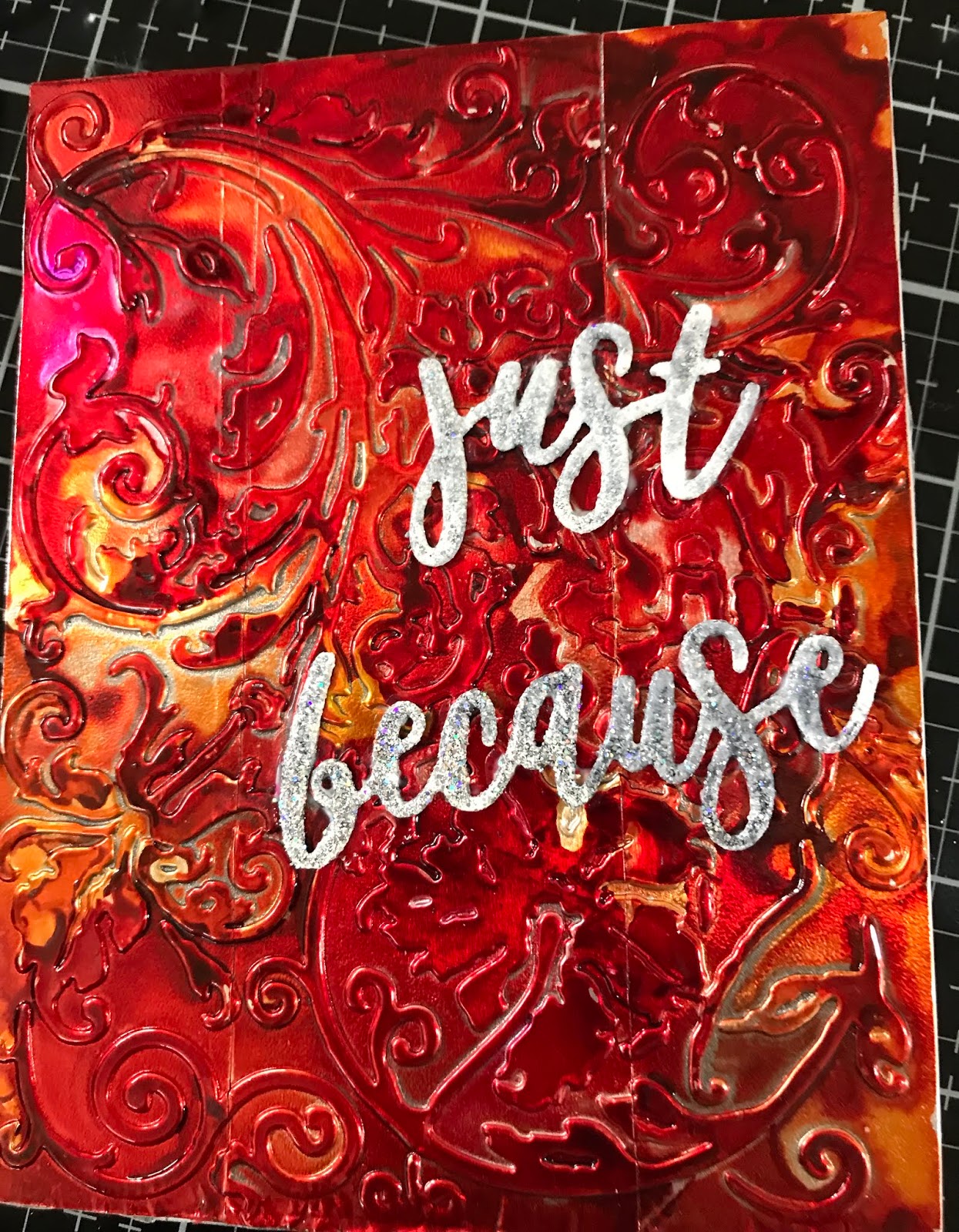
Now for the background..... I wanted some texture, but nothing too outstanding to compete with my beetle....and I wanted an abstract look. 

Since my beetle is metallic, I decided to create a gossamer piece of gold paper for him to perch on.  I thus sprayed Heidi Swapp's gold spray on thin mulberry paper.  The paper resists the spray slightly, leaving a not quite opaque look, and the paper's fiber provide a bit of textural interest. 


For the background, I decided to experiment with a very rough, handmade watercolor paper I had recently purchased with some eco printing in mind....

I sprayed it heavily with the Vibez Taupe of the Morning spray from Shimmerz paints.  The paper is absorbent, and maintained the rough texture....but I wanted more contrast.


Once I sprayed with Lindy's Gang Red Hot Poker spray, I got the look I was going for.


For the sentiment, I knew I wanted to use a small one from the Tim Holtz Theories (CMS 329), and decided to use one of the larger planks from Tim's Bigz die of the same name, since my rusty background reminds me of pine bark.  I cut this from cream card, and keeping with my metallic vibe, colored it with layers of Cosmic Shimmer Metallic Gilding Polish in Apricot, Treasure Gold and Red Bronze.  I then stamped my sentiment with Staz-on black ink.  It looked a little blah, so I put on a thick layer of Clear Rock Candy crackle.


I wanted the crackle to show more, so I put a thin layer of Golden's Shading Gray Fluid Acrylic on, to seep into the cracks.... this is a transparent paint, similar to Payne's Gray in watercolor.... and revealed the crackling quite nicely, albeit made the sentiment a bit hard to read.

Ultimately, my wings now looked a bit unfinished, so I touched them up with Onyxite Treasure Gold wax.... mounted the piece to a piece of black card, and then to a 5 x 7 inch card.  Done!


Thanks so much for hanging in there with me, and please do leave a comment - I love hearing from you and appreciate them all!

I am entering this into the current A Vintage Journey "Precious Metal" challenge, Bleeding Art mixed media challenge, SanDee and Amelies's Steam Punk Summer Challenge, and Creative Artiste current mixed media "Anything Goes" challenge.

Tuesday, July 23, 2019

Heating it up for the Funkie Junkie blog!

 Suzz is hosting the latest Funkie Junkie blog challenge, and she's calling it "It's Heating Up!"  Here's her description: 

July is when the weather here in the Midwest really starts to turn warm and muggy. This is the inspiration for our challenge to interpret the heat with using one or more of the following colors: Yellow, Red or Orange. Your challenge is to create a vintage or shabby chic project where the main color is yellow, orange or red. I can't wait to see how you turn up the heat in your art!

I had several ideas, but settled on using alcohol inks on embossed foil, a technique I have used in the past several times.  With the new Gunmetal and Rose Gold mixatives now available, I was curious to see how well they played with the regular alcohol inks.  

I chose two older Alterations embossing folders from Tim Holtz - one a flourish and the other a damask pattern. 

Although I love the warmer colors, I don't often use them exclusively, so I set myself a challenge to do so, allowing only the mixatives to play along.   I'd had a play a few days ago using only two yellows, and only two reds on embossed foil using the Kaleidoscope 3D folder - although pretty, the inks did not yield the color blending I was looking for. 


So this time, in addition to the gunmetal and rose gold, I selected Honeycomb, Raspberry, Poppyfield, and Valencia Orange, hoping that I could get some lovely blends when the inks meet under the influence of blending solution.


To start, I covered some 110 pound cardstock with foil tape.  I use the kind of tape made to repair heating/air conditioning ducts, as I have leftovers from such a project in Connecticut.  But Ranger also makes foil tape sheets, which Linda carries at the Funkie Junkie Boutique, which are generously sized and somewhat easier to apply, therefore.  Don't worry about wrinkles as these will iron out once embossed.  Once the foiled card is embossed, it looks like this (pardon my reflection - I have roof windows in my studio which make it hard to photograph anything with my poor skills, lol!)


I colored this pattern with lots of the Raspberry and Poppyfields, with a bit of the orange; in the heat of the moment, I did not capture that on my phone.  Then I added a bunch (too much) of the Rose Gold,  I found that the Rose Gold mixative looked very silver and was covering up the colors.  I put a generous amount of blending solution on, and essentially dripped off most of the Rose Gold.  This reaction surprised me, because in an earlier make several years past, I used the regular gold mixative, and it seemed to sink below the colors, only to emerge once things dried, as you can see here.  (This is the Anna Griffin Acanthus folder).


 The silver in the photo of the finished damask card front is the Rose Gold.  The lighter, colored bits are Valencia Orange and Honeycomb.  I shall definitely have another go with this mixative - I think I probably had too much ink on the surface for it to do anything but float on top.


On the flourish card, I went much lighter on using the Poppyfield, as it tends to override the yellow and orange.  Here, I used the Gun Metal mixative, again with a much lighter hand.  It shows just along the spine of the flourish.  But you can see much more of the Honeycomb and Valencia Orange here.  You can also see in this extreme closeup the seams of my tape - another reason to use the foil sheets!  


I finished the cards by attaching to regular card bases, with heat embossed sentiment die cuts from Gina K.  


The "Hugs" is embossed in several layers with Ranger's Liquid Platinum, about which I learned from Butterfly.  The "Just Because" has about 4 different layers of various embossing powders - I couldn't get anything I liked, and ended up with final layers of Ranger's Snowflake Tinsel over layers of liquid platinum and black sparkle.

Thanks so much for hanging in there with me - and please do leave a comment, as I love hearing from you!  I am entering this into the Funkie Junkie "It's Heating Up!" challenge.

Tuesday, July 16, 2019

Seashells on the Seashore for Funkie Junkie Boutique!


I am playing along with a second card for the Funkie Junkie Boutique Challenge "Water, Water Everywhere", hosted by the talented Cec.  Here's what she says about it:

Often when people go on vacation there is water involved – fishing, cruising, checking out the aquarium, enjoying water sports or playing in the sand at the beach. For this challenge I want you to create a vintage or shabby chic project that reminds you of one or more of these past times.

This is a lengthy post, as it is the way I record my process.  You can see the final card at the end if you choose - otherwise, grab a cuppa and read on!

I had recently seen a wonderful tag by Sara Emily, in which she linked to a shell painting tutorial.  The shell in her recent tag is fantastic, so off I went to see how to create this look.


I started with the Tim Holtz Bigz die "Seashells", which cuts a lovely scallop and what looks like a turret shell.  This die also comes with an embossing folder to give the shells beautiful, realistic dimension.

I also used the "Sand and Sea" Bigz die from Tim, which cuts a starfish, a sand dollar, and a seahorse.


I die cut quite a few sets of shells and sand dollars from mixed media paper, embossed them, and per Sara Emily's instructions, gessoed them.  I applied a heavy, rough coating of gesso, as I wanted that wonderful textural detail that actual shells generally have.


While the shells and sand dollars were drying, I started on my card base by taking a full sheet of large Distress watercolor paper, and folding in half lengthwise - I wanted a large piece of real estate to display my shells.  I envisioned them lying in the sand, with the slightest bit of ocean foam from a receding wave which deposited them on the sand.  To lend the notion of sand, after masking off the back of the card, I wet the paper from the bottom about two-thirds up the front with clean water, and then applied a light wash of yellow ochre watercolor.  I let this dry, and then applied directly to the top a light wash of cobalt teal, taking it down over the sand color a bit to blend.  Pardon the shadows; I am still getting used to the lighting in my new craft area!


I put this aside to dry, and returned to my shells.... they were ready to color.  Sara Emily used Distress Oxides, using the "dip and dry" method, by putting an oxide color to your mat, spritzing with water, swiping your piece through, and drying the piece before going to the next color.  I did some of this, but mostly I fund it best to directly swipe the oxide pad onto my gessoed shell or sand dollar, and immediately applying a very light spritz.  Dry and repeat with the same color, or others.... and of course, use your fingers!  I had a blast doing this....


For the sand dollars, I took an additional step of spritzing lightly with Distress Resist Glue, and immediately with Pumice Stone Distress Stain and a bit of water.  Once dry, I applied a bit of  diluted Brushed Corduroy Distress Paint.  I repeated until I got something of a texture, without making them too dark.


I let these all dry, and returned to my card base.  I decided to use glass bead gel for the sea foam, because I knew it would give a lacier effect than texture paste.  I had loosely arranged my shells on the "sand" of the card, and had an idea where the water would show at their top.  I applied generous amounts of the bead gel to these areas - it looks white when it goes on but then dries clear - the beads add the foamy, bubbly look I was going for.  I added more gel to the sand area, as I wasn't sure what might peek through once the shells were arranged and secured.


I left this to dry overnight, and in the morning, added a bit of white back in by gently dapping Picket Fence Distress Paint over the dry gel.  You can see on the right what a difference it makes....


Once the Picket Fence had dried in a few minutes, I took to arranging my shells, and once to my liking, I covered them with Press'N Seal, which would allow me to pick them up in one piece, as they were not yet adhered to each other or to the card.


I transferred the Press'N Seal to a board, then flipped the board over so my shells were face down, with the Press'N Seal on the bottom.


I used liquid adhesive to glue various overlapping areas of the shells together, and then applied a strip of double-sided tape to the entire line of shells.


I then removed the tape backing, and taking the whole sheet of Press'N Seal, I placed it right side up on my card base, and removed the Press'N Seal. 


I glued a few more areas like the star fish bodies that I was not able to get to formerly, and decided to apply another round of glass bead gel with along the bottom, to finish off that edge.  As before, once the gel dried, I painted it with Picket Fence.


 As a final touch, I added an Ideology token with the words "Live Your Dream", after adhering it to a base, and altering with Treasure Gold Green Amber gilding wax.


And here is the final product!  To me, this has a shabby chic feel to it.... and reminds me of shelling along the US Gulf coast when I was much younger.


Thanks for hanging in with me in the very long post!  And as always, I appreciate your visit - please do leave a comment - I love hearing from you!

xxx Lynn