Friday, August 21, 2015

Playing Around for PaperArtsy!


I was very excited when PaperArtsy asked me to post a little something using various mediums.  I have long admired the hot glue work of Vivian Keh, aka Contadina K, and decided to try to emulate that look using clear tar gel.  In addition, I wanted to try using glass bead gel, and to try for an encaustic look using a lot of soft matte gel.

I hope you'll pop over to PaperArtsy to take a look at all of the wonderful demos that have occurred over this fortnight!  This is a photo heavy post for my own records...but at the end you can see the other piece I made using these mediums, a portion of which you see here.

For the piece shown on the PA blog, I started with heavily inked card, using orange and yellow Distress Inks.  From these, I cut out the  Butterfly, Bee and Dragonfly from Tim Holtz' steel rule dies. I did not use the corresponding embossing folders, as I wanted to stamp them instead.

  
I also prepared a background, using Bristol Vellum, and applying various embossed scraps I had (the left-over centers from making the pages for this little book, and stamping with the PA script stamp, which is my favorite.


I applied my various insects with a generous amount of matte gel, and as expected, the Distress Inks reacted a bit to the wet media, so I got a nice golden glow around them.  Once dry, I went over some of their wings and bodies with even more gel, and then I stamped again with the Lynne Perrella stamp to get even more interest.  I used only the very tip of the stamp, as I loved the detail and depth it added.  I used Stays On Ink, as I wanted to cover the whole thing once more with matte gel.


.


Then I put some bead gel wherever I thought I would get good drippage.
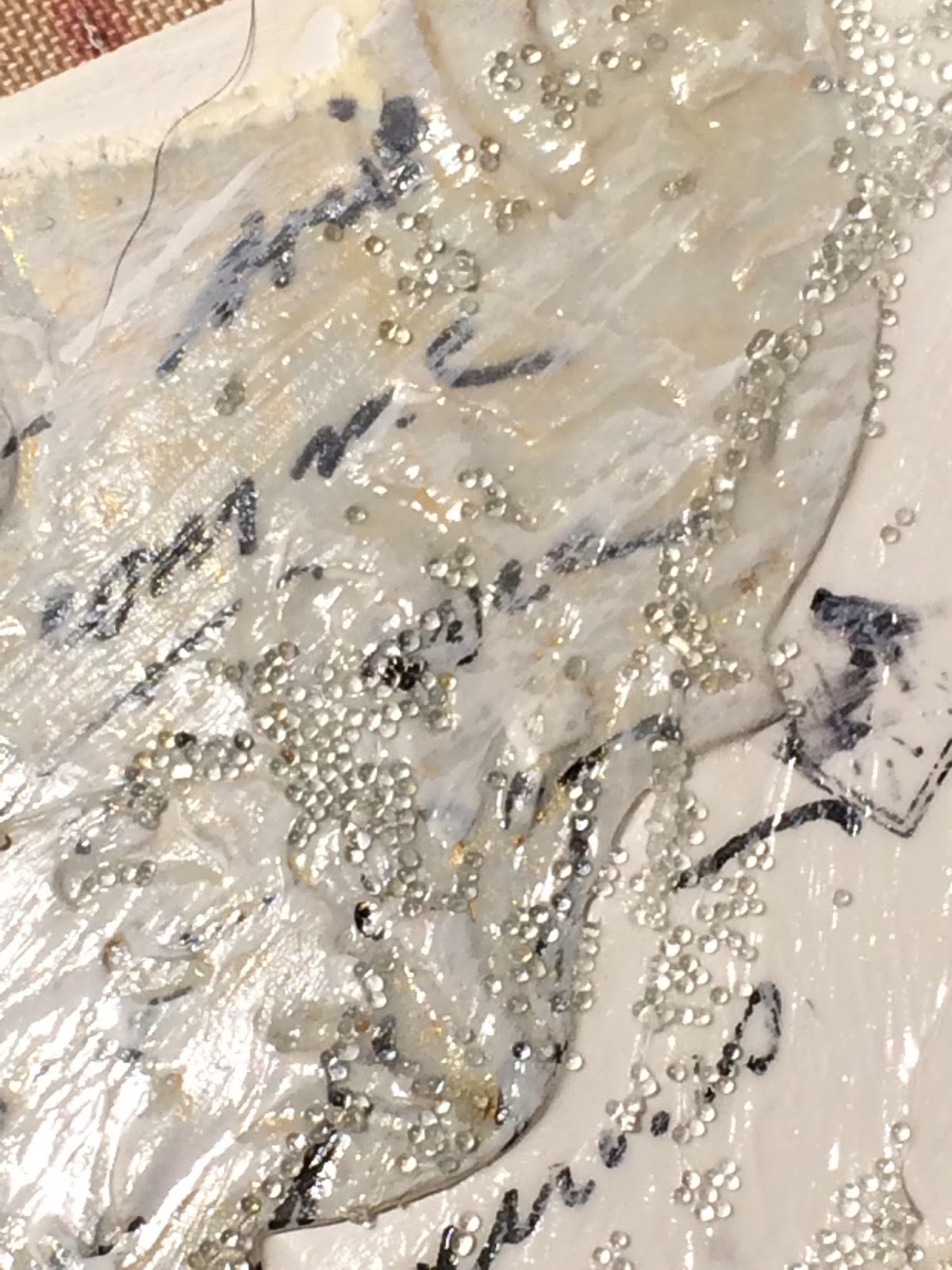


And then I sprayed the whole bit with blue and yellow Distress sprays - I think it was Faded Jeans and Mustard Seed - I was looking not only for these beautiful colors, but that wonderful green when they mix.


As the finish, I added words and a heart by dipping the end of a paintbrush into the tar gel.  It self-levels when drying (I discovered) as you can see below - my "o" and "e" no longer have apertures!  Because the tar gel dries clear, the underlying color or image comes through beautifully.


Here again is a picture of the final pages - very busy but I like looking at them nonetheless!


For the other piece, I also used embossed scraps, some of which also had been previously inked with Distress Inks.  I painted the pages with Fresco Vintage Lace. Again I stamped, but this time my next layer was the clear tar gel.  The color in these shots comes from the reaction of the ink to the gel despite the thin layer of paint....that is why is stops at the edge of the two little tags I used in the background.  The pink is from a doily that I had colored - you can just make out its texture in the background.  I was quite surprised to see the color, and finally realized what it was!


Where the underlying piece was white, the clear tar gel has no color to pick up.  After the gel dried, I again sprayed - I think this is Peacock Feathers and Stormy Ocean.  I then buffed the dried tar gel to remove the ink.


Thanks so much for stopping by, and if you've time, please do comment!  I love hearing what you think!


Thursday, July 30, 2015

Second Finnabair Workshop Piece


It has been a little quiet on the blog, as I have been out west with my family..... I'm getting ready to put up a house on our farm in rural Idaho in the Northwestern US.  It will be a vacation spot for several more years at least, but eventually I will settle here if all goes well.

This evening, as we were readying for dinner, my sister-in-law Beth noticed the full moon over the ridge....


But on to the piece from the second day of the Finnabair workshop at Donna Downey's studio in Charlotte, North Carolina earlier this month!


This is a photo heavy post for my own records, so please feel free to skip down to the final shots.

We started again with three 9 x 12 stretched canvases, with the freedom to design for an East-West orientation or one going North-South.  As I did the last piece in North-South, I decided to try the East-West view even though I don't have a lot of wall space to accommodate that at home.

First, we built up the background with some stenciled texture paste, paper, some left over canvas from Donna's stash, and a few torn strips of Finn's resist canvas.  After arranging all the multiple and varied three dimensional embellishments to our liking, gluing down with a clear drying medium such as Prima's soft gels in matte, we coated everything with several coats of white gesso.


We then started adding bursts of color, using Primary Elements that had been mixed with water in small spray bottles.  I also added some water, to get some drips and blending happening.


We then added some of Finn's wonderful bling, such as micro beads, Art Sugar, Glass Glitter, and Mica Flakes.


Then we added some color accents/further definition with water color pencils, blended with a bit of water once applied.

And here are shots of each panel, followed by the three grouped together.


Thanks so much for stopping by, and if you've time, please do comment!  I always love to hear your thoughts!  xx Lynn


Wednesday, July 22, 2015

Fabulous Time with Finnabair!


I've been quite lucky this summer to have two of my very favorite artists offer workshops within a reasonable distance from my home in Connecticut (i.e., not on the other coast, lol!)  First was the incredible time with Lynne Perella in June.  And just last weekend, I attended two days of brilliant inspiration with Finnabair at Donna Downey's studio in Charlotte, NC.


Here are some closeups..... I don't really have a good photo of the set of three canvases that comprise the entire piece that we made the first day.  The central focus of the composition were two paintbrushes!


We played around with black sand, black gesso and lots of mica powders in fabulous, yummy colors. As you can see, I chose lavender as one of my main colors, along with gold, and a mix of golds and pinks to make a rose gold, which you can see on the brush handles and embellishments above.


When I went back to the hotel that night, I worked on the piece for the Paper Artsy challenge of the last post.

On the second day, we went in the opposite direction on the color palette, by embracing white gesso and using the micas in sprays by mixing them with water.  I don't have detail shots.  As I was flying out cross country to see family directly after the second workshop, I had both pieces shipped out to where I would be staying, so I could show them off :-)  So I will post on the second piece, again three canvases, next week when I receive my package!

Thanks so much for stopping by - I love to have you visit, and please do comment!  I love hearing from you....  xxx Lynn


Time for Paper Artsy!


I decided to use the latest Paper Artsy challenge "Time" to explore a faux patina technique I came across in Nancy Reyner's book Acrylic Illuminations.

I started by cutting the Tim Holtz Weathered Clock and Ornamental dies from card, and then painted them metallic gold and copper, respectively.  I was curious to see how the patina looked on copper.
Once dry, I applied some Golden fiber paste with my finger, making some areas quite thick, and smudging other areas.  I made sure to leave a few bits clear of any paste as well.


The patina effect comes from painting over the fiber paste with Iridescent Bronze acrylic paint diluted with a good bit of water - I think the ratio is around 50:50, but I just kept adding water until the water turned a lovely light turquoise color.  This color is then painted over the fiber paste, providing an absolutely wonderful patina!


 I also love how it worked on the copper piece, which would be the face of my clock.


 Next, I created my background, by apply a generous amount of modeling paste to a gessoed piece of card the size of my journal, and pouncing it with a fairly dry baby wipe to get a rough texture.


Once dry, I coated the page in a rather sloppy way with Pumice Stone and Hickory Smoke Distress paints, spritzed lightly with water, and then pounced again with my baby wipe.  I was going for an old stone look, but it looks more like cement..... oh well.  Next time, instead of pouncing the paste, I will roughly swipe it to get more of a stone feel.


I added two other pieces from my scrap pile, both from the Tim Holtz Baroque die, embossed with a flourished Texture Fades embossing folder which is one of my favorites.  One piece is clear acetate which I had "silvered" with alcohol ink, and the other is a bit of card I had used to mop up a little "oops" moment I had when painting for another project with Tarnished Bronze Distress paints.  I used the patina technique on this latter as well, along with some Ideology letters to spell time.


For a finish, I decided to put my hand to making some flowers, following Pamellia's great video tutorial.  I cut a bunch of flowers from the Tattered Florals die and colored them with a large range of distress inks, to represent each of the four seasons.   I was quite chuffed with the results, and how readily they all went together.


I ended up covering most of my additional pieces, although some of the acetate still shows through with the lovely embossing.


And here is the final project, and another detailed shot.... I'd have liked a more flowing cascade look, but as I was working at night in a hotel room, I didn't have quite the patience or perspective I do at home, lol!  And as my next post will explain, I was lucky to have any creativity at all left in me....


I will be entering this at  Time Challenge at Paper Artsy.

Thanks so much for stopping by, and if you've time, please leave a comment!  I always love hearing your thoughts, and hope you enjoy your visit!  xxx Lynn