Sunday, May 31, 2015

Gilded Bottle for Paper Artsy


I have not yet worked much in three dimensions, so the latest PaperArtsy challenge to use bottles intrigued me!  I love little bottles, and actually found some of the new miniature Tim Holtz Bottles locally.  I thought initially about making a necklace or some sort of thing out of them.  But not sure what technique to use..... painted bottles look pretty but are not my cup of tea (at least yet).


I absolutely love what Alison has done with jars and candles, so began thinking about that.  And then I happened upon Jenny Marple's wonderful technique with glass using alcohol inks.  So I thought to  use these inks,  But then my mind went straight to gilding flakes after watching Jenny's latest make using Flitter Glu with embossing powder.  I look forward to using this incredible glue with embossing powder, but at the moment, I was enthralled with gilding flakes!  I know, I know!  But this dog doesn't learn new tricks readily :-)  Have to go to the tried and true stuff first!

I snagged an unusual bottle from one of my big-box crafting stores (alas, we don't have any truly local stores anymore).  And painted it with Glue N Seal to provide some tooth for the subsequent Flitter Glu and Flake...


Once dry, the Glue N Seal looks like this....


I then patted over the entire bottle with Flitter Glu and applied gilding flake (Morris Dance from Indigo Blu).


To keep the flake secure against handling, I repainted the entire bottle with a light layer of Glue N Seal.  This dimmed the bright flake slightly....but still beautiful.

I then wound very thin gold beading wire around the bottle on diagonals...


and added some glass beads with metal accents to match the predominant gilded flake coloring of teal/turquoise.


And here is the finished piece -


Thank you so much for stopping by!  Please do leave a comment if you've time - I always love to hear what you think!

I will be entering this into the PaperArtsy Topic 10 Bottle Challenge, as well as Brenda's Visual Journey once the new link opens for June....

Wednesday, May 27, 2015

Scenic thoughts from Nicaragua

Recently returned from Nicaragua, I'm gradually getting back into the swing of things here in Connecticut.  In looking through the trip photos, I came across this lovely view of the newly whitewashed Cathedral in Leon, where we were based.  This is an historic cathedral, and generally has been rather grungy due to the effects of weather and pollution over time - but they have done a beautiful job making the grand lady pristine one again.


The photo puts me in mind of Astrid's wonderful recent make featuring St. Paul's Cathedral.  And that inspired me to get in one more challenge this month, specifically for CountryView Craft's latest challenge....it has been a bit quiet here due to travel and subsequent sorting out at work and home.  I've tried to persuade the cats to housekeep in my absence, but so far, they are sadly lacking in that department :-)

As Astrid's make evoked a sense of history, I thought of one of my favorite pieces of art in Nicaragua, this lovely Mary statue, and started browsing through my stamps for an image reminiscent of this icon.


And I came up with this....  I did not take step-outs, as I was in a hurry.... but here are some closeups.


The background is from Lindy's Stamp Gang Nantucket Island Sea Grass Green that I had prepared and not used for a previous project.  Because of the shiny/metallic nature of this spray, I chose to stamp the image with StaysOn Jet Black Ink.  I then colored in with Distress Ink pens in Broken China, and Worn Lipstick.  Her cheeks are Spun Sugar.  I added some recently acquired Tim Holtz star brads in silver as a crown....


I sponged some Pumice Stone Distress Ink through a doily stencil and then added some Tiny Tattered Florals (which I love - they are so easy to make with the included quilling tool!)


The last step was to apply some Wendy Vecchi Crackle Paste through a stencil.... This was then colored by applying a lot of Frayed Burlap to my craft sheet and thoroughly spritzing it.  Then I used a very soft Japanese brush to paint the crackled areas.  And here is the final project.


Thank you for stopping by.... and if you've time, please leave a comment as I always love hearing what you think!

I will be posting this at Country View Craft's May Challenge and Brenda's Visual Journey.

xx Lynn


Friday, May 15, 2015

Dreamy


I was delighted when I saw a couple of the latest challenges out and about in Blogland - lots of themes concerning April Showers and May Flowers, and maybe best of all, Words!  I love script stamps, and had a few new ones I wanted to use. And I finally managed to get my hands on the new Tim Holtz Tiny Tattered Flowers wafer dies.  At last, maybe I would be able to make a decent flower, lol!!

I was inspired by a beautiful tag I purchased from the talented Linda Coughlin of the Funkie Junkie Boutique, where she used the new Lindy Stamp Gang's Nantucket Pearls Starburst sprays. to wonderful effect.

These sprays have the most wonderful silver shimmer against beautiful pastel colors....very different from my usual palette of bright!

As I wanted to enter this make into the Artistic Stamper's Journal your heArRT Out challenge, I started with a journal page in mind.  I also wanted to enter the latest Paper Artsy Topic 9 Words challenge, so knew I wanted to start with script stamping, and keep things as translucent as possible so the words would show up!  


So I started by spraying a sheet of rather heavy cardstock with the blue spray from the Nantucket set.  I let dry, and resprayed several times to get lots of different patterns from the silver.


I then stamped with two stamps I have from the French stamp maker Aladine..... One is a long narrow manuscript stamp, and the other is more along the lines of a post-card.  I stamped them both in Wendy Vecchi's Hydrangea archival ink, in keeping with the blue theme.


I knew I wanted to use a large favorite flourish stencil from Michelle Ward.   Now, how to tackle the transparency I wanted to preserve?

I was rather pleased when I came up with the idea of using clear gesso.....


and only after the fact realized that the gesso, although clear when dry, would actually provide tooth to any subsequent spray.....thus eliminating the look I wanted (words through the flourish parts).  Ah well, isn't art a process of discovery anyway?  May as well figure out what it was going to look like.  And pressed for time (I leave for Nicaragua for a week on University business in two days), however it turned out would have to do!!  The gesso I used was from Prima (Finnabair) and very loose, so my stenciling was actually pretty sloppy.

I turned to one of the Dylusions Dyes, After Midnight, as I love the rich, deep, velvety blue it yields, and sprayed heavily in several subsequent spray-dry-spray routines to get a good amount of color.


Although I love the deep color I ended up with, I rather wish I had stopped after the first go-round, as I ended up losing a lot of the background under the thick layers of consecutive spraying.  On the other hand, it was beginning to look very watery or dreamy..... and could perhaps take me in the vintage direction.

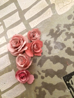
I turned next to making the flowers..... I used a few Donna Salazar spiral rose dies from Spellbinder to get the larger sizes, as the Tiny Tattered Florals are not kidding - they are tiny!!  The measurements below are centimeters.

I cut the flowers from card spritzed with the pink and coral sprays from the Nantucket set, and this time sprayed both sides.  And to my surprise, I soon had a plethora of roses!  


Not the most beautiful, but certainly acceptable, and a darned sight better than I've been doing, lol!!  I later grunged them  up with some Victorian Velvet Distress Ink, though the subsequent photos don't really show that too well.


And so back to the page..... I ended up using a new (to me) stamp from Visible Image, and embossing it with copper embossing powder.  I originally thought about vellum, but I didn't like how it distracted from the background.  And if you look really closely, you can still see some of the manuscript stamping in the background.....


Here is the finished page, and some closeups of the roses.


I will be entering this into Paper Artsy's Words challenge, Artistic Stamper's Journal your heART out challenge, A Vintage Journey's Spring Colors challenge, Mixed Media Monthly's May Flowers challenge, Our Creative Corner's April Showers Bring May Flower's challenge, Mixed Media World's Vintage challenge, and of course, Brenda's Visual Journey #20 blog party.  

Thanks for stopping by, and if you've time, please leave a comment!  I love hearing from you!!

xx Lynn


Sunday, May 3, 2015

All a Flutter

One of my favorite quilting techniques is Paula Nadelstern's Kaleidoscope technique, and although I've nowhere near her talent I've had a lot of fun with the technique....


and have long been thinking how to do this with paper.  So, inspired by the latest PaperArtsy challenge to use sprays, I decided to spritz up some brightly colored papers with a bunch of Dylusion and Distress Sprays.


Yummy, rich colors..... but now how to add further interest with stamping?


I've been admiring various projects using beautiful butterfly stamps, and as I have a few myself, I settled on that.  Imitating kaleidoscope patterns requires fairly symmetrical patterning, which most full-on images of  butterflies have.  I also was looking for something to alleviate a lot of fussy cutting, so I used those stamps with corresponding wafer dies to cut the images, such as the recent  butterfly stamp and die sets from Stampendous and Tim Holtz

And pretty soon I had myself a pile of butterflies ready to go!


I messed around with color and size placement for a bit....


as well as the conundrum of how to work within a rectangle, instead of a circle..... as I wanted this page in my journal.


I ended up deciding to cut some of the images to allow for more intricate piecing, and not using the purple at all as it really dulled the page down.

Here is what I ended up with, after affixing everything with matte medium in my favorite fine applicator, a tip picked up from the wonderful France Papillion:


I'll keep playing with this idea as I peruse my stamps for symmetrical images.  In the meantime, out of curiosity, I looked up the name for a group of butterflies:  "swarm" - doesn't seem appropriate; "rabble" - what the heck?  But hey, "kaleidoscope" and "flutter" - those work just fine, lol!!

I will be entering this into the "Use Bright Colors" challenge at Mixed Media World, the"Use Sprays" challenge at PaperArtsy, the "Things with Wings" challenge at Fashionable Stamping Challenges, and of course posting at Brenda's Visual Challenge #18.

Thanks so much for stopping by, and please leave a comment if you've time - I always love to hear what you think!  xx Lynn