Friday, September 25, 2015

Playing with Pigment Powders for Paper Artsy!


A very late entry to Paper Artsy for this Pigment Color challenge.....


I continue to love working with texture pastes and gels after exploring these for Paper Artsy recently.  After reading Astrid's recent post about saving our bees, I played around some Ken Oliver Color Bursts, thinking I would try to achieve some crackle by mixing some powdered pigment into the crackle medium.


I first mixed a bit of gold Primary Elements mica powder into matte medium and applied through a Tim Holtz honeycomb stencil, and then applied the altered crackle medium.  I then applied metallic gold acrylic paint, and it was immediately clear that the crackle was not happening, although the Color Burst background is pretty. I added some gold metallic acrylic paint, but still no crackle. I like the glow I got when I heavily diluted the paint. But still, not a go.  I forgot an earlier experimentt mixing some type of pigment with crackle paste, which also failed to get the crackle!
So, back to square one, and forget about the crackle!  I had swiped the leftover gold mica homemade paste onto a tag so not to waste it....

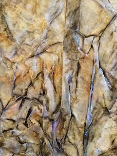
when this dried, I ran it through a wrinkled distress technique with Wild Honey, Seedless Preserves and Ground Espresso Distress Inks - applying these to my craft sheet,spritzing with a bit of water, and swiping the tag through.  When dry, I sprayed with some Heidi Swapp gold spray.  Loved what resulted!


And it looked like to moon to me.... so I decided to try some other versions - here with black mica.
After the black mica version dried, I added some stars by stenciling with Wendy Vecchi gold embossing paste,
And once the stars were dry, I swiped the tag through Tumbled Glass, Broken China and Dried Marigold Distress Inks using the wrinkle free distress technique, as with the previous tag.  Once dry, I spritzed with Heidi Swapp gold spray.


I made one more version, this time using copper Primary Elements with Wendy Vecchi translucent texture paste:

which, when dry, I spritzed with Iced Spruce and Wild Honey....

and then when dry, spritzed with Smooch sprays in yellows and browns, though these do not show in the photos.  Once done, I cut the tags to eliminate the hole, and placed on a journal page - phases of the moon.


I am sharing this at the latest Paper Artsy challengeMixed Media World Autumn Colors, and We Love To Create "Anything Mixed Media, and

Thanks so much for stopping by, and please do leave a comment - I always love to hear what you think!  xx Lynn

Monday, September 7, 2015

Dream On


I am definitely sliding in on the late side to the "Touch of Gold" challenge..... so many good intentions, so little time, lol!  But today, while attempting to clean up my workspace, I came across a lovely mop-up tag I had made with a combination of beautiful teals, blues and gold spray.  It reminded me of a late summer's sky.  In the mess of my "clean up" (which seems to entail just moving stuff around!) I spotted a favorite stamp, waiting to be catalogued and "filed" in my collection of DVD cases, which continues to grow when I manage to actually catalogue!

And now, having seen the stamp, and thinking how great it would look clear embossed with distress ink, off I went (using Peacock Feathers DI).  And sure enough, it did look great (though so much for more cataloguing today!)  I then got so wrapped up in going on to the next step, I forgot to take in-between pictures, so for my own purpose am recording my process narratively - feel free to skip ahead!

A pensive theme was in my mind, I suspect because my neighbor Margie (of Ecoprinting) departs later this week to complete the Camino Finisterre, a contemplative journey comprising the end of the famous Camino Santiago, which she completed some years ago with her late husband.


The notion of pensive, reflective thought of course took me to journaling, and I decided to add some script to the background of my tag, using Versamark ink this time, but repeating the use of clear embossing powder.  I was surprised that the ink pulled up some color, but it is very subtle.  You can just see the shine of the clear embossing above.


I added a Tim Holtz Word Band that resonated with me.  I darkened the words with Black Soot Distress Paint, and after wiping off excess paint, I swiped the band with some rub-on metallic wax paste (similar to Treasure Gold).  It looks coppery here, but is actually gold.  I secured the tag with some bronze wire I have in my stash (since I cannot find the gold I know I have somewhere).... and added a seam binding ribbon dyed with Peacock Feathers, Stormy Sky, Broken China and Tumbled Glass.

Here is the completed tag. Much simpler than most anything I've done....maybe less is more for me in the coming months!


Thank you so much for stopping by, and if you've time, please do leave a comment.  I read them all and love hearing from you!!  xx Lynn


Sunday, September 6, 2015

Texture for Mixed Media World


Some months ago, a friend asked if I would participate in a fundraising effort for Artists for Soup, a group that is working to improve the food security of Nicaraguan women.  This particular effort will take place in November, as an auction of altered cigar boxes and other items that artists want to donate.  Since I have a special place in my heart for Nicaragua, of course I said yes!  I had been watching some Paper Artsy videos on mediums and gels, and decided to try some heavy clear gloss gel through a stencil, and also to play around with home-made mica spray, having learned about that at a recent Finnabair workshop this summer.
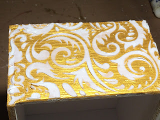
I started by sanding my box, removing a lot of the paper, and in the process accidentally removing the paper hinge to the top.  Then I painted the outside surfaces with gold acrylic paint and applied a rather thick layer of heavy gloss gel to each of the four sides of the box and the top of the cover.  This will dry clear, and provide (mostly) a resist effect with the mica.


 Here is what it looks like when dry, and then when sprayed with a mica spray made from a deep blue Primary Elements powder and water.


 For the inside, I places several layers of white tissue paper with matte medium, building up the surfaces to look soft and velvety once the sprays were placed.  I used the same mica spray, supplemented with a commercial gold spray - I think it was Heidi Swapp gold.  I used the same technique for the inside of the cover.


Here is what the insides look like once sprayed.
 Below is the top.... I fashioned a handle from various Prima embellishments I had left from the workshop and some buttons.

 And here is one of the sides....you'll notice that I glued some little feet on to complete the look.

 And here is a very poor shot of the final box..... it is hard to photograph without shadows today!


I hope to finish a second box, which you can see below.  I am again using the tissue paper technique, but this time on the outside, based on what I did here on one of my early makes.... I absolutely love all the glimmering, shiny textures!  And it is so fun to use all the Lindy's Stamp Gang metallic sprays I own.


But I need to figure out how to nicely finish the inside.... kinda stymied on that at the moment (the "nicely" part especially), lol!  If you have any ideas, please let me know!


Thank you so much for stopping by, and please if you've time, leave a comment - I love hearing from you!  xxx Lynn